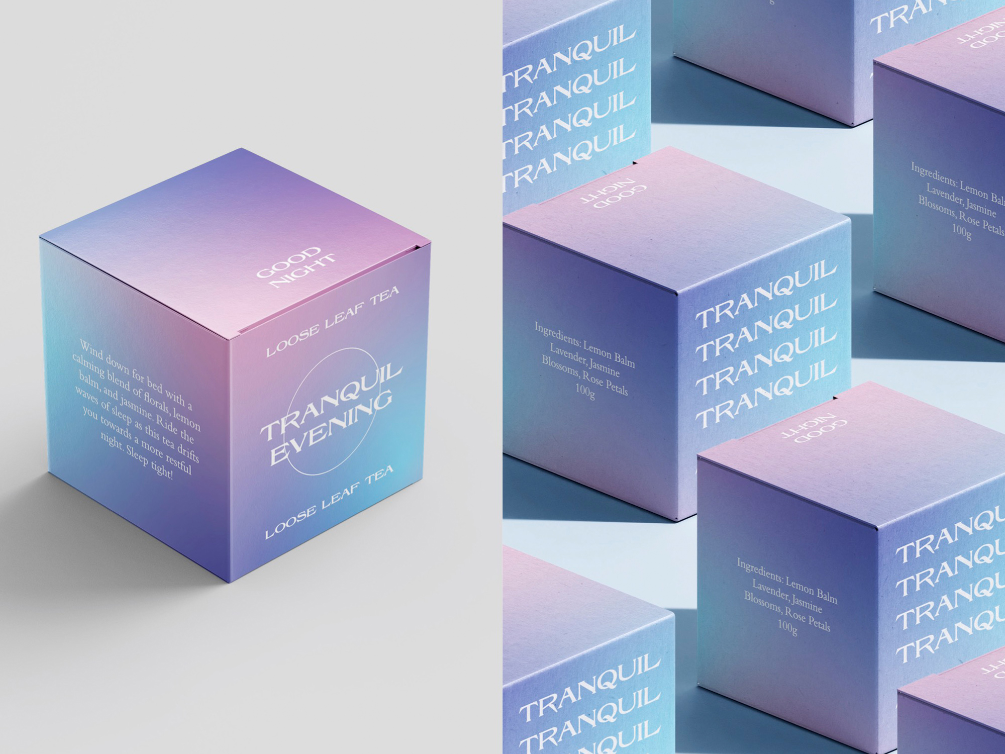

The brief for this project was to design a cohesive series of food packaging that is sustainable and appealing to consumers. My response was to create Tranquil – a brand that is all about mindfulness and taking a moment for yourself. The colour scheme of each package correlates with the time of day, with warm sunrise tones for the morning, and dark sunset hues for night time. The flowing pastel gradients connote to the idea of mindfulness, creating a bespoke appearance that will stand out on any shelf.